
Monday, 29 April 2013
Leopard print on celebrities
Sarah Jessica Parker was spotted in a leopard print scarf to spice up her plain outfit, the scarf adds some fashion/spark to her outfit. By seeing celebrities in a certain trend in magazines and on the Internet inspires people to go out and buy the item so they look like the celebrity and have similar clothes to them. So by leopard print being spotted on celebrities already it means the trend has already started, and soon will be in the high street stores and soon to be on everyone's 'to buy' list.
Friday, 26 April 2013
Photo shoot plan
I have done a test shoot in the neon clothing, in my house to see what the model and the clothing looked like, I was very happy with the look and the clothing. I wasn't happy with the lighting though and after doing some photographer research and finding Dan Kennedy's work I decided I wanted to take the pictures outside with a plan background, but not in a studio I wanted the background to be natural like a fence or a brick wall but I didn't want it to be to detailed as I didn't want the background to take the focus of the clothing, so I wanted the background to be quite neutral.
I decided it would be a good idea to take the pictures in my garden; some along my shed and some along the wall along the side of the house.
I will use the same model as I did in the test shoot and all the same clothing which I have ordered of a website and some of the clothing is from mine and my models wardrobes, but I have ordered some of it particularly for this shoot.
Dan Kennedy
Dan Kennedy is a famous fashion photographer, who's work I really like, I looked at some of his work on his website and really enjoyed looking at it. I wanted to get some inspiration from photographers so I could get some ideas of where I could start when taking my pictures. I new my pictures wouldn't look as professional as Dan Kennedy's work but I did want to get some inspiration from his work.
His work was all different, but I was focusing on the pictures that were more about the clothing, I noticed that a lot of his shots did have backgrounds but they were pretty basic so it didn't take the focus of the model and the clothing.


His work was all different, but I was focusing on the pictures that were more about the clothing, I noticed that a lot of his shots did have backgrounds but they were pretty basic so it didn't take the focus of the model and the clothing.
Thursday, 25 April 2013
WILD JUNGLE

I did the same for this trend board as I did for my other board, I just designed a rough trend board so I could get an idea of how I wanted it to look and what pictures I could use. I annotated around the trend board again and noted all the things I wanted to change and what I didn't like.
BRIGHT FRENZY

I wanted to design a trend board so I could get an idea of how it would look, and how I wanted to lay it out. Once I designed a board on illustrator and was happy with it, I printed it off to see what it actually looked like, I then annotated my board and wrote around the side what I want to change about my board.
Once I printed my board I noticed a lot of things that I didn't actually like and didn't look professional, and to the standards I wanted it to look.
I took note of everything I wanted to change and I will edit my board on illustrator and try to find better images that will give a better feel and go with my trend.
cultural brailing

This sheet about cultural brailing in class helped me out a lot when it come to identifying trends. This method shows step by step how you can write about identifying a trend. I found this really helpful, as when I saw a trend that I liked, I looked back at this method and broke it down, to help me write some information about the trend I was talking about.
Customer Profile for Wild Jungle

Customer Profile for Bright Frenzy

My target audience for this trend is girls aged between 16-21 so it doesn't have a big age range but neon colours would only be suitable for certain ages, and by having a smaller target market means I can be more specific. The customer would shop in shops like H&M, Republic and online shops like Miss-guided and Boohoo, all these shops sell reasonable priced items and are usually cheaper than other high street shops like topshop and river island. The customer are also students or just starting out in a job, but they aren't very well-off yet, so they don't earn much money to be spending on clothes and this trend will have good priced items so it is affordable for its target market.
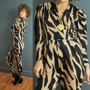
animal print
My animal print trend was bodycon and fitted clothing which was tight and would show of the models figure, I thought I would call this trend 'WILD JUNGLE' as the animal prints that are included in my trend are animals from the wild/jungle, and when I looked at the clothing I was going to use for my shoot, it reminded me of a jungle. I think by the trend being called 'wild jungle' when people first look at the name of the trend they will automatically realise that the trend is to do with animal prints.
Neon History
The neon colour first started in 1910 and become very popular for 'neon signs' in America during 1920 to 1960 and then in the 1980s was when the clothing become popular. Lately the neons have started to become more popular, as neon crop tops have started to appear during the winter, and according to WGSN the catwalks show that neons are going to be a big hit next A/W too, the neons have come back into fashion slowly and I think by next year they will be a good trend.


Pinks
On WGSN they had a special colour section, of colour forecasts for A/W 14/15 and I wanted to see if neons were going to be popular as I wanted to focus on neons for one of my trends. The colours did include some really bright colours, which included bright pinks which I really liked and would match my neon theme.
I got some pictures of WGSN of some pink clothing that would fit in with my 'neon' theme.


I got some pictures of WGSN of some pink clothing that would fit in with my 'neon' theme.


yellows
I also looked at this bright yellow colour which caught my attention, WGSN say that all these 'warm' colours are going to be very popular for A/W 13/14 so I wanted to get pictures of products that were this colour, so I could understand what the colour would look like on a model and what type of clothing would look best in the colour.
After looking over these pictures I really liked the colour, I thought it really stood out and would look very nice in the winter, as it would brighten up any outfit and make the outfit look special and attractive.


After looking over these pictures I really liked the colour, I thought it really stood out and would look very nice in the winter, as it would brighten up any outfit and make the outfit look special and attractive.


animal print history
Animal print was a big part of the 80's especially tiger and snake print.
'Name an animal, and chances are its hide has been converted into an article of clothing in the '80s. Snakeskin, zebra print, and leopard were notorious for appearing on pants, jackets, and everything in between'


I really like the animal prints, so I researched when animal print was popular, and it was a big hit during the 80s with the 'hippy' look, I got a couple of images of what they wore. so I could get an idea of how similar the style of clothes are.
mood-board research
I wanted to research different types of moodboard and how to lay them out, I looked on google images and on WGSN to look at different trend boards, so I could get an idea of how the boards are layed out, and what design layout would look best.

These two images are from WGSN, which are quite simple and get to the point, I really like the colour palettes at the bottom of the boards, as it gives the viewer an idea of the main colours that the trend will include. They are very basic, but the images that are on the board come across very strong and shows the focus of the board.


These are examples of fashion mood boards which I found on google images, I didn't like these mood boards, I thought they were to crowded and looked like everything had been cramped together to fit on one page. All the pictures were so close together, I couldn't even get a clear look at the images individually.


These two images are from WGSN, which are quite simple and get to the point, I really like the colour palettes at the bottom of the boards, as it gives the viewer an idea of the main colours that the trend will include. They are very basic, but the images that are on the board come across very strong and shows the focus of the board.

These are examples of fashion mood boards which I found on google images, I didn't like these mood boards, I thought they were to crowded and looked like everything had been cramped together to fit on one page. All the pictures were so close together, I couldn't even get a clear look at the images individually.
first neon shoot
I ordered and found some neon clothing which I could use in my shoot, I was looking for crop tops, pencil skirts and disco pants, to give the sporty feel which I wanted for my Neon trend.
I wanted just to test what the clothes would look like, so I took a few pictures upstairs, outside my bedroom so I could get an example of what the model/poses and location were like, as I haven't done this before.


I did like the clothes, and I thought the model worked well with this type of clothing, so I will use her as a model. But the lighting is very dark, so when I come to taking the actual pictures for my styling board. I will have to change the lighting and I also want to change the location of the shoot, I want my pictures to be taken outside during the daylight so the light can be natural and light enough for a clear picture.
Thursday, 18 April 2013
Animal Bodycon
I had already decided I wanted to focus on prints for one of my trends, and when I researched into more detail I found that animal print was popular for A/W which is when my trend will be based for.
I also noticed that long bodycon dresses were popular and so were long pencil skirts, I really liked this trend, as the longness of the skirts and dresses added sophistication to the clothes.
I decided to put the bodycon trend and the animal print trend, together and use them as the same trend for my A/W trend 14/15.


floral embroidery
For S/S 13/14 I have already research into floral patterns on clothing, however by looking again on WGSN, I found that floral embroidery was popular on the catwalks. I found two dresses where floral embroidery had been used, and I did really like it, I thought it looked really nice, and make the dress look very special. These two dresses were Valentino dresses.


Neon trend board
I decided to create a trend board for my final piece, I wanted a colour palette on the board, to give viewers an idea of what the new trend is going to be focused on. And what colours are going to be used.
 This is the trend board I came up with, I got the pictures from websites including google images/WGSN, and I positioned them where I thought they would look best.
I want the Neon Theme to be based on neon coloured clothing but I would like the neon clothing to be sporty' but also suitable for an evening out, but not a classy outfit I want it to be sporty at the same time, as when I think of neon colours I do think of sport look. I want the neon clothing to be suited for a 'disco' party or a neon party, where neon clothing would be acceptable however heels etc will not be necessary.
I did like my mood board however when I printed it and looked over it, I thought I needed to change the picture of the model, because the model is dresses with heels and a bag, however with my shoot I would like to go with the more 'sportier' look, and I wanted to make the 'disco party' image smaller because at the moment I feel like that is the main picture, and I don't want the main image to be text, I want it to be an image. I also am thinking
about changing a couple of the small images down the side as I
think them images could be better.
Transparent Bags
I noticed a lot of transparent bags in the magazines recently, so I looked on WGSN for these bags, and they was in the A/W 14/15 trends, so although they are already in the magazines and in a few high street stores, according to WGSN they will get more popular in time.
I think the bags are very unique and strange looking, but I do think I like them, although it is a little bit worrying that everyone will be able to see in your bag either when you are walking down the street or out in a night club, some personal things may be on show, so you would have to be careful of what you put in the bag. You would also have to be careful not to put anything valuable in the bag as people will be able to see what is in the bag, and you could be making yourself more of a target with valuables on show.


Chunky jewellery
A/W 14/15 accessories, involved a lot of chunky jewellery, it all looked like statement pieces which would make any outfit standout. Most of the jewellery was yellow gold colour or had coloured jewels in them. I really liked the jewellery as all of it could go with any clothing, the jewellery would make any outfit look more special and stand out.


I really liked the chunky pieces of jewellery that I found on WGSN, and this type of jewellery is already selling in high street stores like Top shop/River Island. I have noticed chunky necklaces become very popular already.
NEON THEME
I have chosen to chose neon as one of my trends, as the research I have done has proved for neons to be very popular with the A/W trends 13/14. On WGSN neons have proved to be very popular on the catwalks for next A/W. I have chosen neons as it has always been slightly popular, but recently I have noticed neon clothing coming back into the high street stores, so I think by next year neons will be a big trend.
I think this trend will be more popular with daywear/casual clothing, I think neons is very sporty/diva like, so I think the neons colours will be most popular with trainers as I have also realised from WGSN research that trainers are proving to be very popular and are becoming more and more popular over time.
I looked at hairstyles which were going to be popular for A/W 13/14, i think natural wavey hair will be suitable for this shoot
The neon was a bright colour trend, so when naming my trend I needed a really stand out, 'wacky' name, so I decided to call the trend 'Bright frenzy' I thought frenzy was a good word to use as it means 'a period of uncontrolled excitement' and I want this trend to cause uncontrolled excitement, so I think this name is perfect for this trend.
Monochrome
WGSN ANALYSIS
- Theme: 1960s modernist; op-artchequerboard patterns, spots, grids and stripes
- Key shows: seen in New York at Marc Jacobs, Alexandre Herchcovitch
- Direction: scale is key, with oversized chequerboard and mixed-scale matching separates. Experiment with the direction of stripes and spots and create playful prints combining grids, spots and stripes
- Colour: monochomatic black and white embodies the trend
- Market: works best for the young contempoary fashion market but also works for directional tailoring
i got the above information of WGSN to give me some information about the monochrome new trend. The trend has come from the 1960s, I have noticed that the vintage pages on WGSN are all fashion trends coming back which originated from the 60s.


Subscribe to:
Comments (Atom)